Forms+Surfaces
Branding + Web Design
Driving user engagement for a multi-million dollar design and manufacturing company
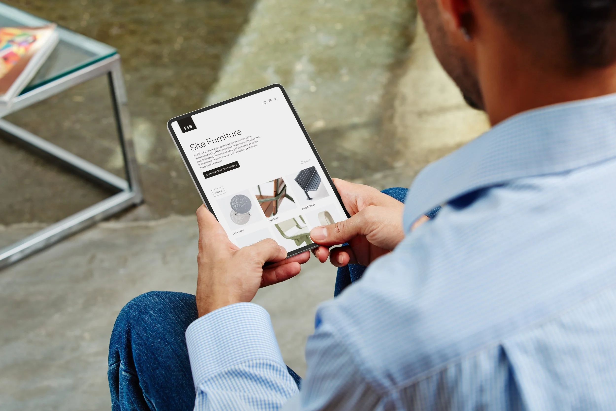
A complete overhaul of the Forms+Surfaces brand identity and web presence led to 150% increase in user engagement and a 40% decrease in site size and page management.
COMPETITIVE ANALYSIS
QUALITATIVE RESEARCH
UX DESIGN
UI DESIGN
PROJECT MANAGEMENT
COPYWRITING
QUALITY ASSURANCE
Great company, great products, plenty of problems
Forms+Surfaces has been a world-class provider of architectural products for over 70 years. They are masters at fusing cutting-edge technology, artful design, and precision manufacturing to produce industry leading solutions. But, based on their branding and web presence, you would never guess it.
The old brand was static and forgettable. With a greyscale color palette, Arial typeface, and neutral tone of voice the F+S brand did little to inspire greatness.
And when it came to the website, well, at least you can say it was consistent with the brand. The web experience was at once overwhelming, with its complex navigation and technical jargon, and underwhelming, thanks to its tiny images and static, repetitive nature.
The goal of this project was to give F+S a new identity and a website worthy of showcasing the company’s great products.
We started by discussing the kind of company we were and who we wanted to become.
The existing brand did very little to tell the story of F+S. How old was the company? What did it value? What kind of people worked here? The answers to these questions (and others) would form the foundation of the new brand identity and, thus, the website.
The problem was, this kind of information wasn’t documented anywhere.
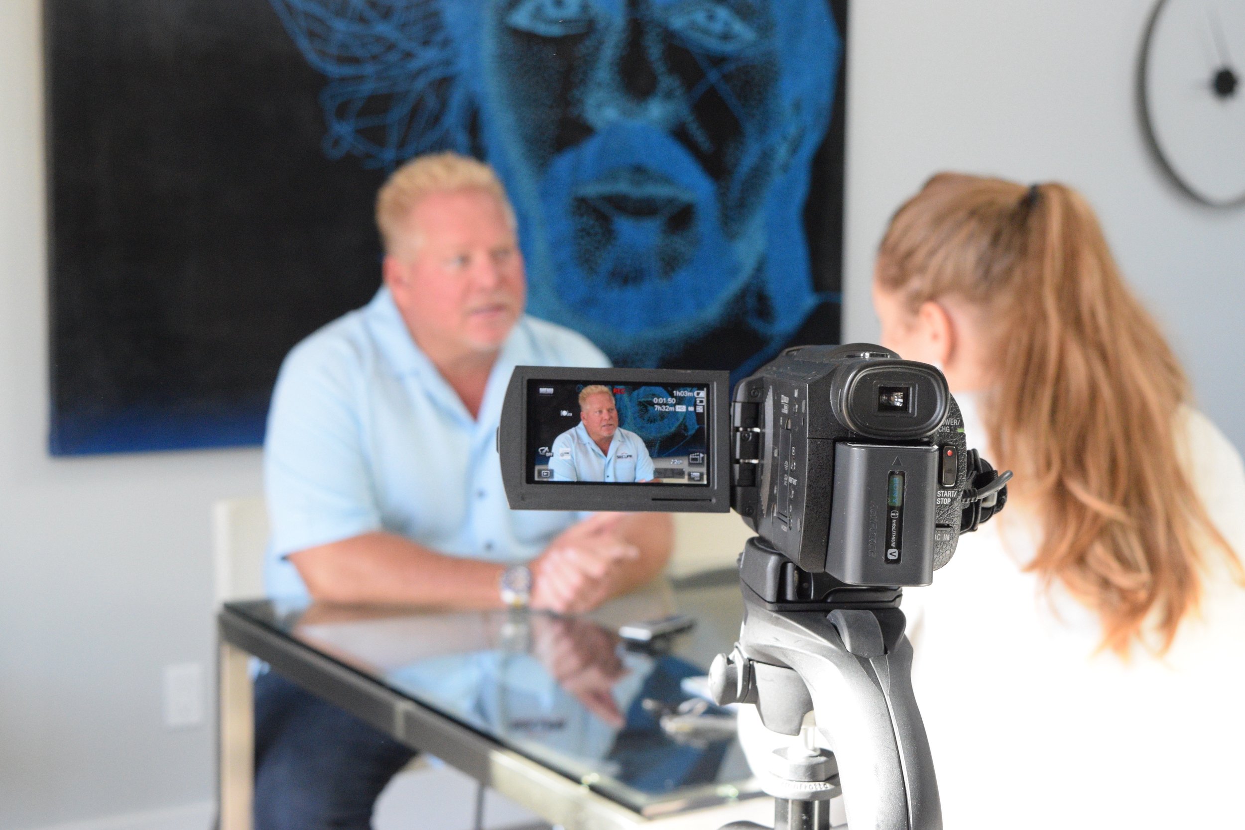
Everything about F+S lived in the minds of the executive board members who had been with the company for decades. So I put on my user researcher hat, grabbed a notebook and pen, and sat down for qualitative interviews with each executive team member.
“I dread when someone asks me what F+S does because it’s so unique in terms of what our company can do...
“...but I think, if I were to sum up how we approach the business, [...] it's all about design that is relevant today and will be relevant tomorrow.”
-Jeff Stork, CEO
What did the interviews reveal?
After completing all 6 interviews I began going through each conversation line by line. My goal was to find patterns and discrepancies in what the company leaders believed. By identifying areas of alignment and misalignment we could begin having conversations about the kind of brand we wanted to build.
These interviews provided insight into how the website and brand have developed to this point. Having this history in hand would be helpful in building a new marketing and web development strategy.
Actionable Insights:
Our products embody the spirit of F+S: timeless, minimal, highly designed. This should form the foundation of the new brand.
F+S is rooted at the intersection of technology, design, and manufacturing. This triple threat sets us apart from our competition.
The website is a derivative of how business was done prior to the internet, so it’s developed into a glorified product database, not a true sales tool.
We struggle to succinctly explain what our company does or why we are doing it. In other words, we don’t have a mission statement.
Defining the company’s mission. Together.
Before we could begin designing any visual elements of our identity, we had to define the purpose of F+S. This came in the form of a new mission statement, which would form the foundation for all brand decisions moving forward. All other elements, from logo to copy to typeface, had to resonate with our mission statement.
With that in mind, I guided all 6 executive team members through a collaborative, multi-day exercise in devising a statement that captured the essence of F+S.
Every word in the new statement was chosen with intention and each idea builds upon the previous sentiment. Just like our company and our products, the new mission statement was minimal, direct, and carefully crafted.
The New Mission Statement:
Design and manufacturing made to last.
Responsibly connecting people to the built environment for generations.
We used the mission statement to define the rest of our brand
At the heart of the F+S identity is a single idea: our products are our strength. They set us apart from our competitors and connect us to our consumers. For this reason, all of our branding is designed to play a supporting role. We want you to notice the beauty of our products first and our brand second.
-
We developed a new logo that features our company initials. This is supported by our wordmark, which would be used sparingly.
-
The color palette features warm neutral tones that compliment our imagery.
-
The Akkurat typeface was chosen because it balances our precise yet artistic nature.
-
Our commitment to precision and technical excellence is reflected not only in how we look, but also in how we sound. There are 3 considerations that guide the F+S copywriting process:
-We write with our audience’s priorities and limitations in mind. Time and accuracy are the highest importance for landscape architects and architects, so all written content should be as clear and concise as possible.
-Like our visual identity, our tone has a neutral personality. We focus on being professional, yet approachable. Our voice is reminiscent of a museum docent - reserved, knowledgeable, and ready to supply any extra information the audience may need.
-The last thing we want to do is mislead or confuse our audience. When we write, we prioritize clarity by sticking to factual statements. Subjective adjectives should be used only in the appropriate context.
Then we started to build the new company website
With the foundational components of the brand established, it was time to start designing the new company website. I decided to start with sketches of mobile screens. Why hand sketches? I believe that starting away from the screen forces a designer to focus on the overarching story they want to tell rather than the fine details. Sketching helped me capture the essence of the new website: one that put imagery and people at the center of it all. I intentionally started with sketches of mobile screens to ensure our content, and mindset, was responsive.
The team was unaccustomed to critiquing sketches and it became clear after a few critiques that they primarily thought of the website as a desktop-only experience. So it became evident that a strategy pivot was needed. I began iterating in Figma, using existing content and a web format. For every page created, I made sure to create its mobile counterpart to maintain the responsive element.
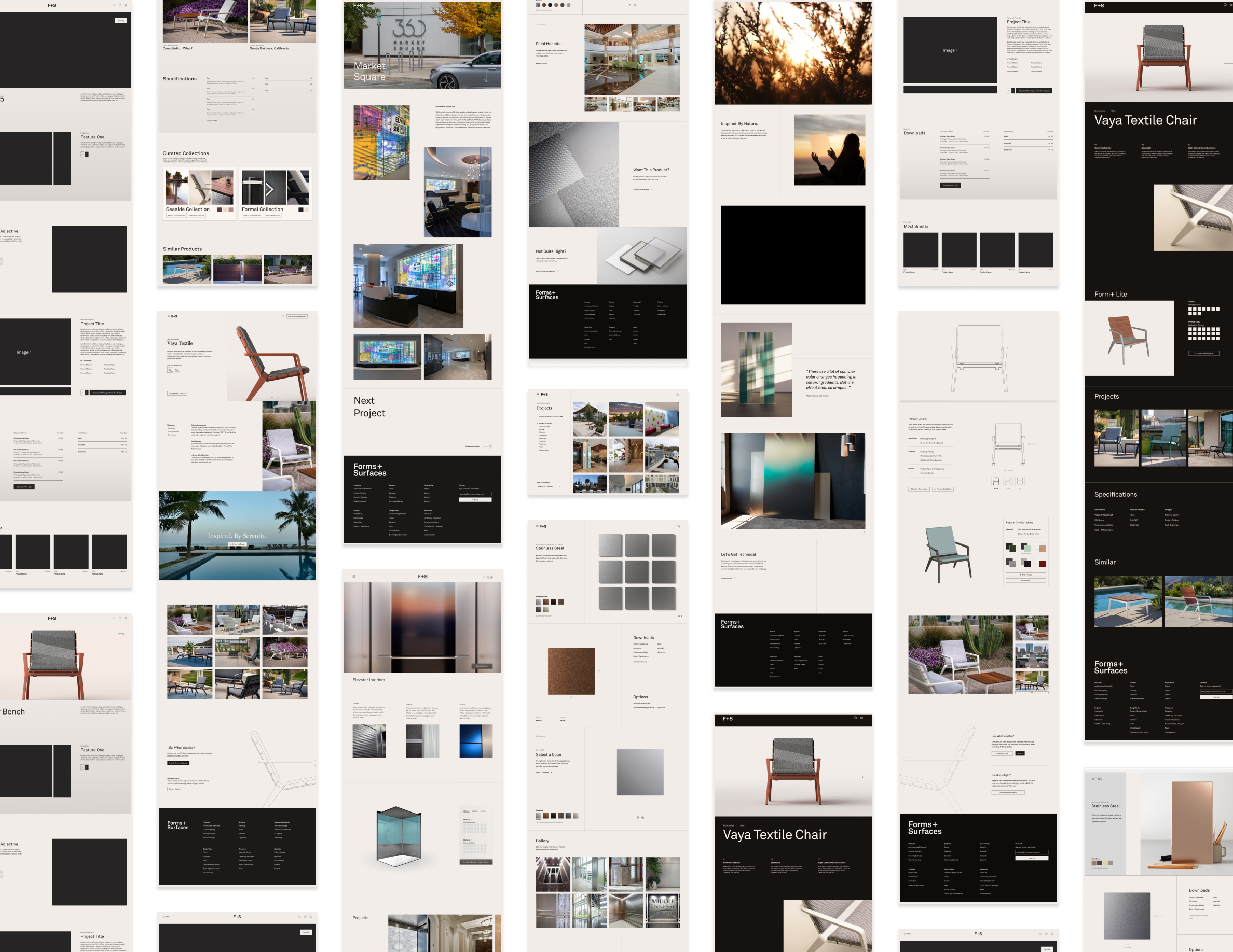
We fixed the content structure (and the user workflow) while improving the UI
The old website structure required a user to navigate up to 5 different pages to find the information they needed. Pair this digital maze with vague product names and we had the perfect recipe for losing customers.
Knowing that our users valued clarity and quick access to information, we rebuilt the information architecture to require fewer pages. Furthermore, the new structure featured common phrases and wording, making navigation a simpler exercise.
At the heart of the new website is a very simple component library
The entire UI design of the new site is based on the atomic design system, and each atom reflects the brand’s subtle, minimalist aesthetic. Corners are sharp to characterize our precision engineering, all lines meet at ninety degree angles to enhance our + motif, and there is ample spacing between atoms to underscore our confident and stoic nature.
Animations were kept to a minimum so as not to distract from the main content.

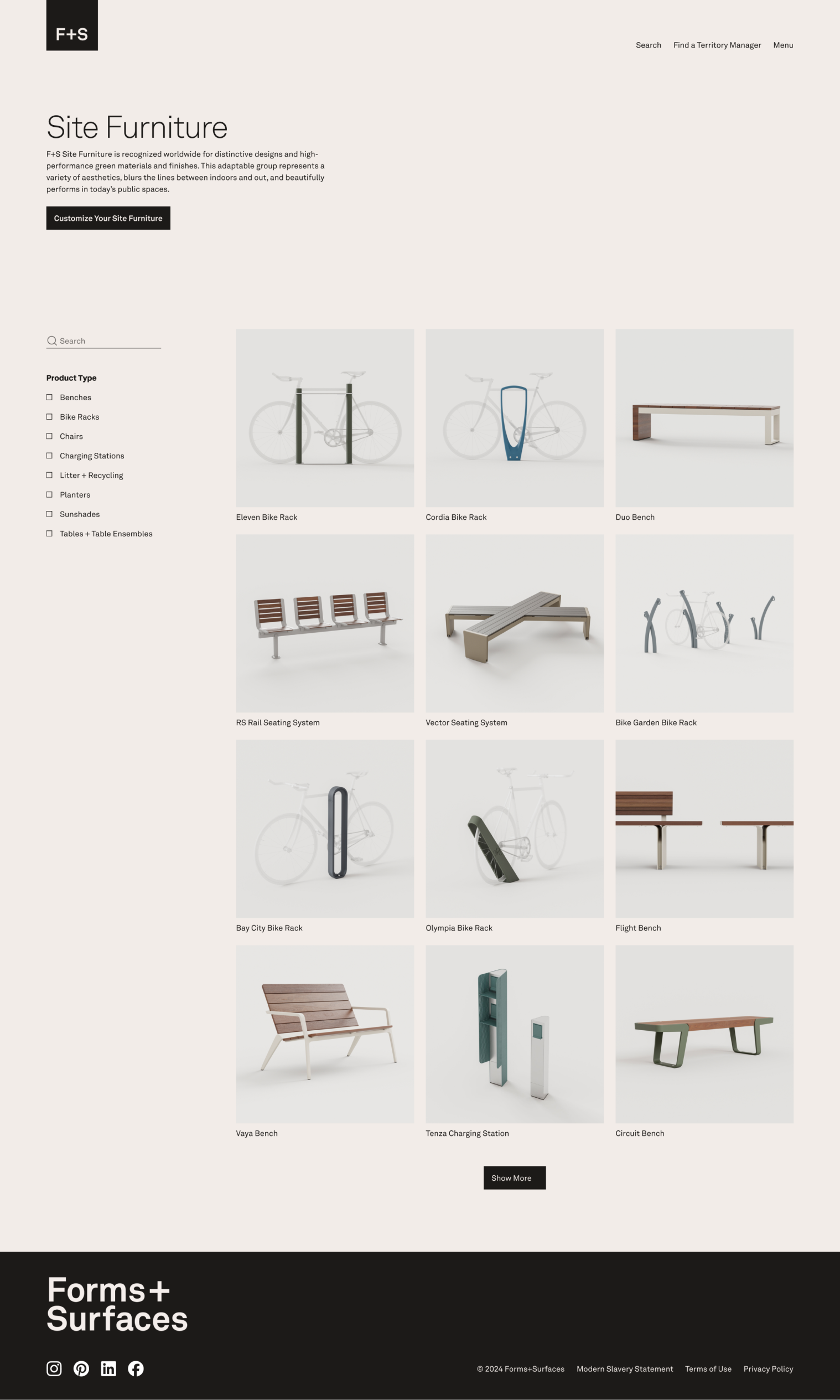

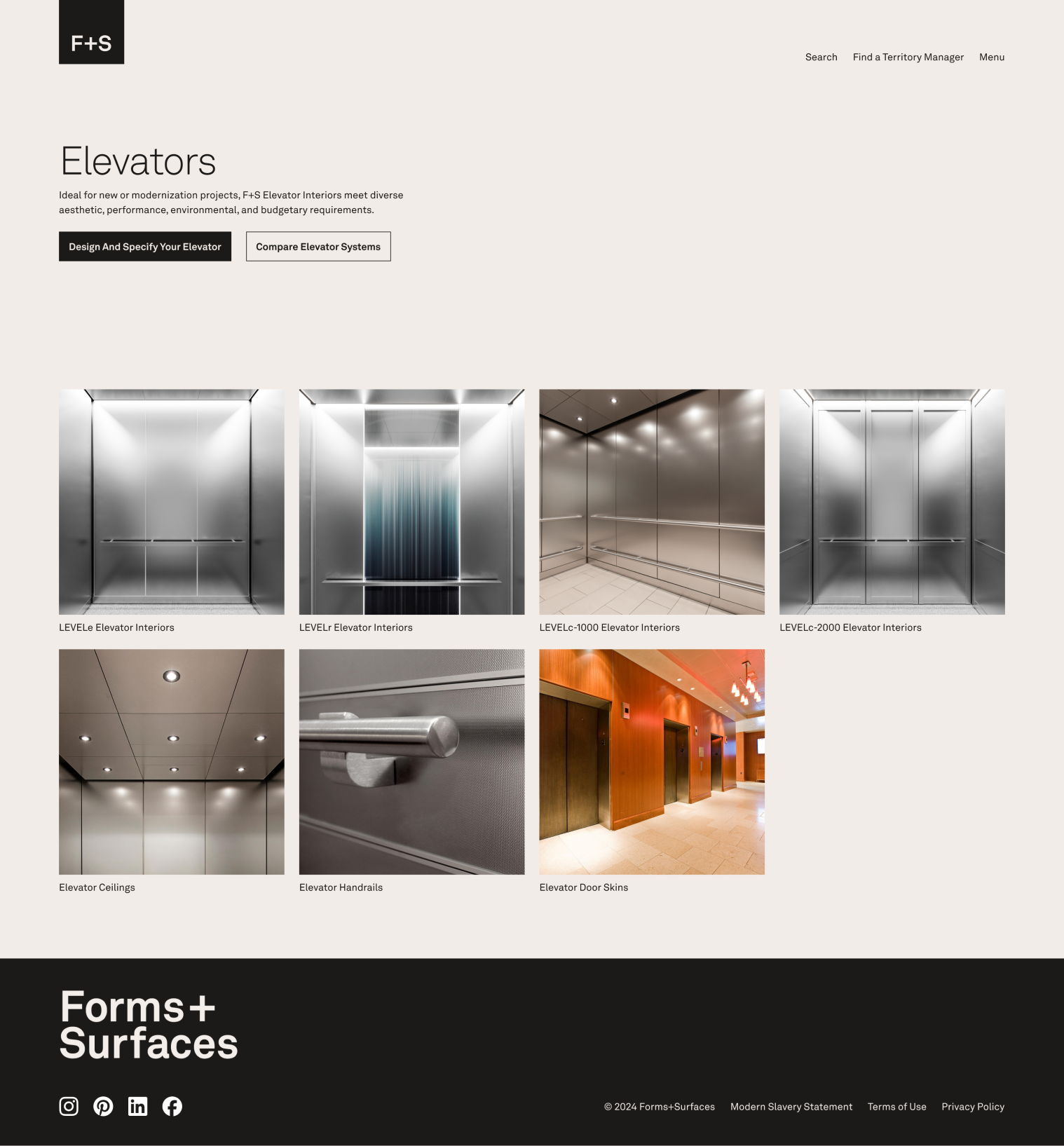
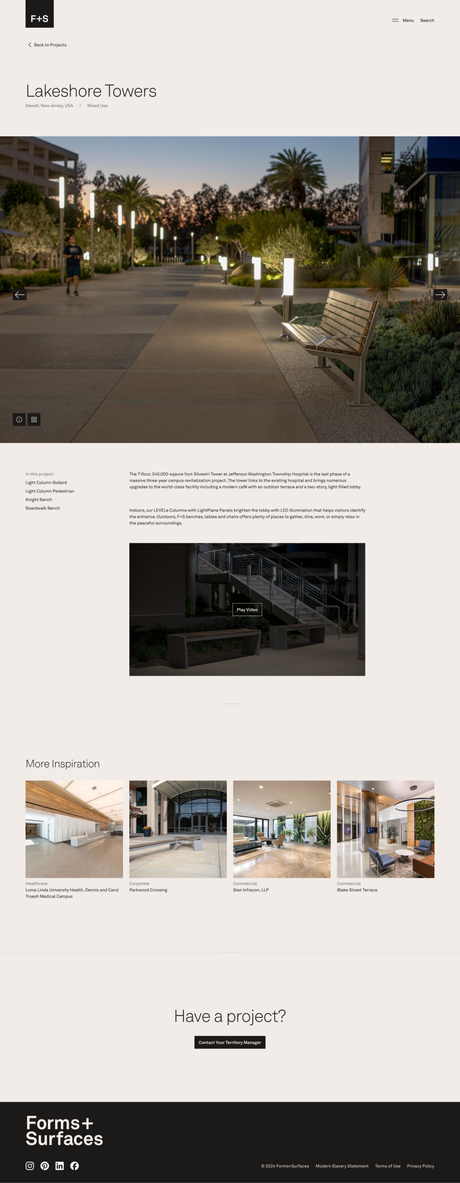
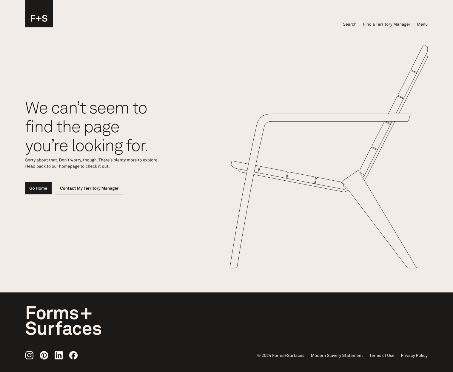
The new site went live on May 30, 2024.
The first phase of the brand rollout was met with much praise from internal and external users alike. While the site is not yet complete (we are still making some CSS updates and uploading content), we have already seen a massive benefit to the structural and aesthetic changes we’ve implemented. We still have plenty more to do, though. Phase 2 will feature an update to design tools, curated videos, and more human connection elements like quotes from the industrial design and production teams.
